The Power of the Virtual Sticky Note

On my team, we’re just past the two-year mark of a fully remote work environment (with a few rare exceptions). I sometimes long for the days of sketching on a massive whiteboard, bringing pads of sticky notes and boxes of sharpies to almost every meeting.

two people at a physical whiteboard covered in sticky notes
UX team in-person debrief, 2019

I’m not a fan of talking-only meetings, which is what we expect from most of our Zoom meetings. Too often, one or two people dominate the discussion and others don’t contribute, often because they aren’t encouraged or given the opportunity. And when you have sometimes 6 or 7 hours of Zoom meetings in a day, it can be especially rough.

I would much rather be doing things in our meetings: visualizing concepts, generating ideas, solving problems, creating something new. We used to do this with whiteboards and sticky notes in our physical meeting rooms. Fortunately, we have tools that can mimic the experience. So I thought I’d share some examples.

Retrospectives

We love our retros, and sticky notes are a must to allow people to generate all their thoughts on what we’ve learned for the future. When we did our first Tiny CafĂ© since the pandemic began, we did a retro to discuss how everything went. On top of using sticky notes to share comments, we used stamps to up-vote things we agreed with.

virtual sticky notes groups under headings Continue, Stop or change, and Act now
Retrospective using Figjam

At the end of last spring semester, we did a broader team retrospective using the 4 L’s: what we liked, learned, lacked, and longed for.

sticky notes responding to the prompts, what did we accomplish? what worked well for you? what worked well for the team?
Retrospective using Miro

At the closeout of the recent Advancing Research, my attendee cohort did a version of a retro by using Miro to share what stood out to us, what we wanted to do next, and how we might stay connected with one another.

Sticky notes under headings What stands out? What now? How to stay connected.
Retrospective using Miro

Debriefs

Soon after a research session (e.g., user interview, usability test), it’s helpful to debrief on what stood out and begin to identify any patterns. More in-depth debriefs after a lengthier studies are also important as you start to dive in to the analysis. This is usually a wall of sticky notes in a physical space, but virtual can work just as well.

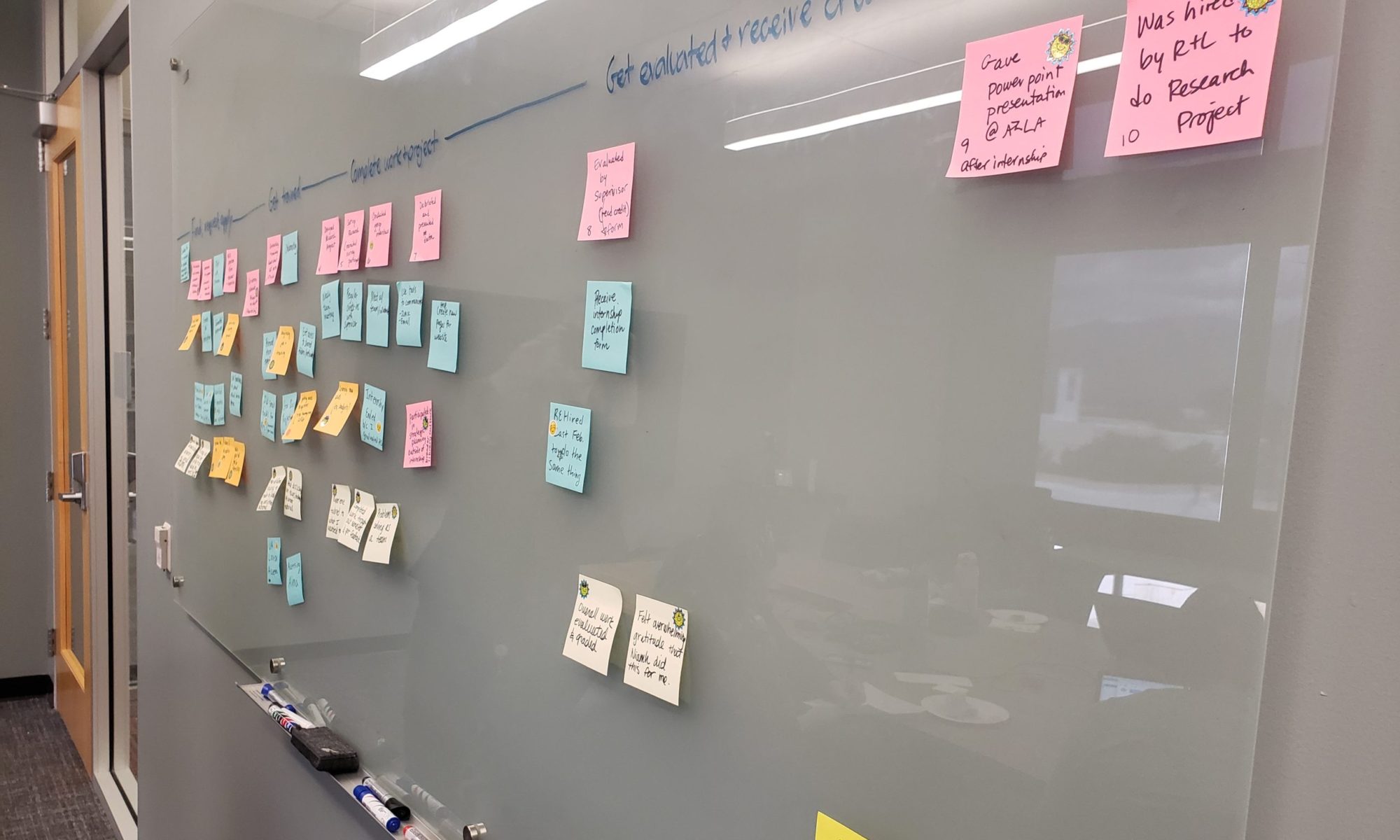
virtual sticky notes on three rows: Getting hired and onboarding, interviewing, and applying. Color coding with good experiences, pain pints, and neutral.
Debrief on employee experience study using Miro

Emotions check-in

How we feel matters and impacts how we approach our work, and I’ve found great value in practicing awareness and naming emotions out loud. In a recent meeting where we were tackling a thorny issue around organizational structure, we started by asking how everyone was feeling. Using a Figjam board with some pre-populated descriptors on sticky notes (as well as the option to write something new), people named their emotions with stamps.

A grid of sticky notes responding to the prompt, "How are we feeling today?" Stickies up-voted include: eager, ready, overwhelmed, challenges.
Learning how people are feeling using Figjam

I helped lead a similar activity at the end of the Advancing Research conference to see how people in my cohort were feeling after three days of conferencing.

sticky notes with feelings written on them including: challenged, motivated, inspired, frustrated, tired
Learning how people are feeling using Miro

Team planning

We do kickoffs at the beginning of each semester, and use remote collaboration tools extensively. At our most recent one, we found Figjam helpful for identifying skills areas to build. Since we all had Figjam accounts, we were able to place our avatars on sticky notes.

sticky notes responding to the prompt: what skills do you want to build most?
Identifying learning goals using Figjam

Team thank-yous and celebrations

Virtual parties can sometime be awkward and sometimes a bore. Inviting colleagues to share their kudos and thanks can be a great way to foster appreciation and recognition.

Sticky notes in boxes labeled: Rachel helped me.., Rachel helped our team..., Rachel helped the library..., We all love Rachel for..., We'll see you again
Employee farewell recognition using Miro

Idea or artifact reactions

When we were embarking on a website redesign project last year, we put a screenshot of the existing homepage up in Miro, then asked people to add their comments and observations using sticky notes and reactions.

website screenshot for Health Sciences Library marked up with emojis and sticky notes
Getting feedback on a design using Miro

Notetaking

Less about collaboration, but I’ve been playing around with using these tools for visual notetaking. Sometimes I’ll use physical sticky notes for capturing takeaways when attending a conference. Virtual tools have some benefits and more flexibility to add screenshots, connect ideas, and re-group things as you go.

sticky notes and stamps with key points from a talk about research repositories, plus two screenshots of slides and speaker on Zoom
Notetaking using Figjam

Getting creative

These are just a few examples of some of the ways I’ve used virtual sticky notes to facilitate engagement, participation, and richer employee experiences.

Are you working remotely? What are some other examples of ways to leverage the power of the virtual sticky note? Share in the comments!
Practical Personas: Built Collaboratively and Purpose-Driven

We’ve been using personas at the University of Arizona Libraries for a good while as design and communication tools for different projects. I’ve learned a lot from our different attempts at persona development, so wanted to share my learnings here. In particular, how we’ve collaboratively created personas, leading to buy-in and shared ownership across the organization.

Previous personas

I believe it was 2011 when we first tinkered in persona development. But we made several missteps on our first attempt. We:

  • based them on assumptions (rather than research)
  • created them in isolation (by the 4-person Website Steering Group of the time)
  • used stock photos and stereotypes

They were pretty silly and simplistic, and didn’t really help us build empathy for our users. I remember the donor persona, in particular, was inspired by Daddy Warbucks and became more of a joke than an actual tool for our conversations.

In 2014, we gave it another go. This time, we created personas specific to our Website Redux project where we were re-designing the digital user experience. We based them on data, including web analytics, usability testing, and surveys. We shared them with the library at a “Meet Our Personas” open house event.

people standing around table learning about personas
“Meet Our Personas” event

These became much more useful, particularly as we incorporated them into the Redux project. We used them in:

  • User stories, the framework for all web development work (e.g. “Cheyenne wants to reserve a room from her smart phone.”)
  • Content planning, as we associated every new or revised web page with particular persona(s)
  • Project updates, as we held monthly brown bags and used them as a basis for much of our work

We also distinguished between our primary and secondary audiences. We had 4 primary personas:

  • Cheyenne, the freshman
  • Brandon, the PhD student
  • Emily, the graduate student and teaching assistant
  • Renee, the faculty member

And 3 secondary personas:

  • Donald, the potential donor
  • Elle, the library staff member
  • Craig, the community user
7 personas from 2014
Snapshot of personas from 2014 website project

2018 Persona Project

Context

Come 2018, a number of things had changed. Our content strategist who provided leadership in persona development, Shoshana Mayden, left for another position on campus. We had hired a new content strategist, Kenya Johnson, who also played the role of marketing and communications manager. I had moved out of the technology unit into our administration, providing vision for our UX work library-wide. We also realized that hey, it’s 2014, and Cheyenne the freshman is graduating.

Most of the library staff were familiar with personas. In addition to having used the 2014 personas for several years in the context of our website, we’d also had a design thinking project in late 2017 that gave library employees the experience of creating their own student and faculty personas. This design thinking project also gave us a wealth of new user research data.

So in spring 2018, Kenya and I started working on developing new personas that could be used library-wide.

Intention

We wanted the new personas to be a bit different. We wanted them to:

  • Be useful and adaptable for different project needs
  • Be inclusive and diverse
  • Avoid stereotyping

We identified the purpose of personas as design and communication tools that:

  • consider the users’ perspective and experience, not ours
  • help us understand our audience
  • encourage us to question our assumptions
  • ensure we focus on what matters to people and has the most impact
  • provide a useful foundation and starting point for any project

We wanted personas to help us:

  • describe and empathize with our target audience
  • get on the same page about who we are designing for
  • guide decisions related to services, products, content, design, and more

Workshops

We invited all library staff to attend collaborative workshops to build our personas. We held multiple workshops at different times to allow people to attend no matter their work schedule.

We ultimately had 35 attendees including people from varied departments including technology, access services, research and learning, health sciences, and marketing. In the first 1-hour workshop, we:

  • reviewed design thinking personas
  • conducted mock user interviews
  • identified behaviors, motivations, and constraints of particular user types
Two people presenting a sketch and sticky notes version of a persona
Second persona workshop

In the second 2-hour workshop, we:

  • created teams; created goals, behaviors, constraints for 5 personas
  • identified names, quotes, and photos for personas
  • presented personas to the larger group in a creative way

Our new personas

Persona for Nate with goals, behaviors, and constraints
Final persona for Nate the navigator

Informed by the outcomes of the workshop, we created the following primary personas:

  • Nate the navigator
  • Sam the scholar
  • Isaiah the instructor
  • Linda the learner

And secondary personas:

  • Esmeralda the explorer
  • Evan the employee

One of the main shifts from our previous set of personas was that these were structured around purpose rather than status. We had discovered over the past few years that many of our services weren’t geared specifically to a demographic such as undergraduates, graduate students, or faculty members. Rather, they were geared towards an audience based on their purpose.

Our research services serve all researchers, whether they are faculty, staff, students, or visiting scholars. Our instructional services serve all instructors, whether they are teaching assistants, faculty, or adjunct faculty.

When consulting with staff on projects, such as research support services, we’d often hear things like, “Well, it could be a PhD student or a faculty member, or maybe even an undergraduate.” So we’d often end up with three or four personas listed as an audience for a service, which was less helpful. So we shifted from thinking about students vs. faculty members and started thinking about learners vs. scholars. And recognized that depending on context, an individual could play the role of different persona identities throughout their experience with the library. Someone might be working on a class assignment in the morning, teaching a course in the afternoon, and navigating library spaces in the evening. We’ve found this to be a much more helpful framing.

Final persona for Sam the scholar

Rollout and training

Kenya and I presented the final personas to our library leadership team, encouraging them to use them in upcoming projects and to share them with staff. We also provided hands-on training to departments upon their request. In one-hour training sessions, we presented the personas and had people break into small groups. They worked through a Project Starter where they came up with a project (usually a real one), identified their primary persona(s), adapted them as needed, and thought through how the persona would help guide their design and communication decisions.

We were hopeful that by developing the personas collaboratively and through the hands-on training sessions, people across the library will find them useful in their daily work.

Adoption and adaption

Since launching the personas, they’ve proved helpful for a variety of projects, including the design of new websites, tutorials, and services. The staff who attended the workshops are also now equipped to develop personas whenever they find them useful.

I’ve probably found our new personas most useful as a starting point. Project teams will take one of the personas and adapt it to best fit their purposes. Since these were created in Powerpoint, they are easy to update to fit a particular need. By providing complete personas as well as adaptable template, we’re helping empower staff to place users at the center of their projects, informing their conversations and their decision making.