My first project at Ad Hoc LLC was an overhaul of a state agency’s website, the Louisiana Department of Agriculture and Forestry (LDAF). Check out the website we launched last fall at: ldaf.la.gov. 🎉
Partnering with LDAF stakeholders, we were able to improve task success rates, reduce time on task, and increase user confidence in the website overall. I led research for the project, which included market/competitor analysis, a top tasks survey, card sorting, tree testing, first-click testing, and usability testing (pre- and post). There was also a ton of information architecture and content strategy work.
It comes as no surprise to most that government websites can be hard to use. And getting a chance to improve this website for the people of Louisiana was really rewarding.
Being on a small yet mighty UX team means we try to do a lot with a little. To scale up and broaden our impact, my team has spent much of the past year prioritizing ResearchOps and DesignOps. Essentially, it’s about optimizing our “Operations.” Improving the “how” of what we do. Doing it better, faster, and with greater impact.
Since we act like an internal agency and consultancy, much of what we do is teach people how to do UX. We serve a 200-person library organization with just a handful of us, not to mention the 50,000-person university that also regularly approaches us for support.
The demand is too great for us to conduct all the research, write all the content, and curate all the design. We often find ourselves reinventing the wheel as we point clients to various articles, case studies, and the occasional template. So we realized that if we could create a playbook of UX practices, we could reduce our one-off efforts, empower our colleagues, and better build UX expertise campus-wide. So we did.
With the leadership of Bob Liu, our UX designer, we recently launched The UX Cookbook. A public website filled with 7 easy-to-read recipes so far covering:
We have many more recipes in the works, including ones focused on content planning and strategy, information architecture, and web analytics. It’s early days yet, but I’m pretty excited we now have this resource to share UX recipes with people at the University of Arizona and beyond.
We’ve been using personas at the University of Arizona Libraries for a good while as design and communication tools for different projects. I’ve learned a lot from our different attempts at persona development, so wanted to share my learnings here. In particular, how we’ve collaboratively created personas, leading to buy-in and shared ownership across the organization.
Previous personas
I believe it was 2011 when we first tinkered in persona development. But we made several missteps on our first attempt. We:
based them on assumptions (rather than research)
created them in isolation (by the 4-person Website Steering Group of the time)
used stock photos and stereotypes
They were pretty silly and simplistic, and didn’t really help us build empathy for our users. I remember the donor persona, in particular, was inspired by Daddy Warbucks and became more of a joke than an actual tool for our conversations.
In 2014, we gave it another go. This time, we created personas specific to our Website Redux project where we were re-designing the digital user experience. We based them on data, including web analytics, usability testing, and surveys. We shared them with the library at a “Meet Our Personas” open house event.
“Meet Our Personas” event
These became much more useful, particularly as we incorporated them into the Redux project. We used them in:
User stories, the framework for all web development work (e.g. “Cheyenne wants to reserve a room from her smart phone.”)
Content planning, as we associated every new or revised web page with particular persona(s)
Project updates, as we held monthly brown bags and used them as a basis for much of our work
We also distinguished between our primary and secondary audiences. We had 4 primary personas:
Cheyenne, the freshman
Brandon, the PhD student
Emily, the graduate student and teaching assistant
Renee, the faculty member
And 3 secondary personas:
Donald, the potential donor
Elle, the library staff member
Craig, the community user
Snapshot of personas from 2014 website project
2018 Persona Project
Context
Come 2018, a number of things had changed. Our content strategist who provided leadership in persona development, Shoshana Mayden, left for another position on campus. We had hired a new content strategist, Kenya Johnson, who also played the role of marketing and communications manager. I had moved out of the technology unit into our administration, providing vision for our UX work library-wide. We also realized that hey, it’s 2014, and Cheyenne the freshman is graduating.
Most of the library staff were familiar with personas. In addition to having used the 2014 personas for several years in the context of our website, we’d also had a design thinking project in late 2017 that gave library employees the experience of creating their own student and faculty personas. This design thinking project also gave us a wealth of new user research data.
So in spring 2018, Kenya and I started working on developing new personas that could be used library-wide.
Intention
We wanted the new personas to be a bit different. We wanted them to:
Be useful and adaptable for different project needs
Be inclusive and diverse
Avoid stereotyping
We identified the purpose of personas as design and communication tools that:
consider the users’ perspective and experience, not ours
help us understand our audience
encourage us to question our assumptions
ensure we focus on what matters to people and has the mostimpact
provide a useful foundation and starting point for any project
We wanted personas to help us:
describe and empathize with our target audience
get on the same page about who we are designing for
guide decisions related to services, products, content, design, and more
Workshops
We invited all library staff to attend collaborative workshops to build our personas. We held multiple workshops at different times to allow people to attend no matter their work schedule.
We ultimately had 35 attendees including people from varied departments including technology, access services, research and learning, health sciences, and marketing. In the first 1-hour workshop, we:
reviewed design thinking personas
conducted mock user interviews
identified behaviors, motivations, and constraints of particular user types
Second persona workshop
In the second 2-hour workshop, we:
created teams; created goals, behaviors, constraints for 5 personas
identified names, quotes, and photos for personas
presented personas to the larger group in a creative way
Our new personas
Final persona for Nate the navigator
Informed by the outcomes of the workshop, we created the following primary personas:
Nate the navigator
Sam the scholar
Isaiah the instructor
Linda the learner
And secondary personas:
Esmeralda the explorer
Evan the employee
One of the main shifts from our previous set of personas was that these were structured around purpose rather than status. We had discovered over the past few years that many of our services weren’t geared specifically to a demographic such as undergraduates, graduate students, or faculty members. Rather, they were geared towards an audience based on their purpose.
Our research services serve all researchers, whether they are faculty, staff, students, or visiting scholars. Our instructional services serve all instructors, whether they are teaching assistants, faculty, or adjunct faculty.
When consulting with staff on projects, such as research support services, we’d often hear things like, “Well, it could be a PhD student or a faculty member, or maybe even an undergraduate.” So we’d often end up with three or four personas listed as an audience for a service, which was less helpful. So we shifted from thinking about students vs. faculty members and started thinking about learners vs. scholars. And recognized that depending on context, an individual could play the role of different persona identities throughout their experience with the library. Someone might be working on a class assignment in the morning, teaching a course in the afternoon, and navigating library spaces in the evening. We’ve found this to be a much more helpful framing.
Final persona for Sam the scholar
Rollout and training
Kenya and I presented the final personas to our library leadership team, encouraging them to use them in upcoming projects and to share them with staff. We also provided hands-on training to departments upon their request. In one-hour training sessions, we presented the personas and had people break into small groups. They worked through a Project Starter where they came up with a project (usually a real one), identified their primary persona(s), adapted them as needed, and thought through how the persona would help guide their design and communication decisions.
We were hopeful that by developing the personas collaboratively and through the hands-on training sessions, people across the library will find them useful in their daily work.
Adoption and adaption
Since launching the personas, they’ve proved helpful for a variety of projects, including the design of new websites, tutorials, and services. The staff who attended the workshops are also now equipped to develop personas whenever they find them useful.
I’ve probably found our new personas most useful as a starting point. Project teams will take one of the personas and adapt it to best fit their purposes. Since these were created in Powerpoint, they are easy to update to fit a particular need. By providing complete personas as well as adaptable template, we’re helping empower staff to place users at the center of their projects, informing their conversations and their decision making.
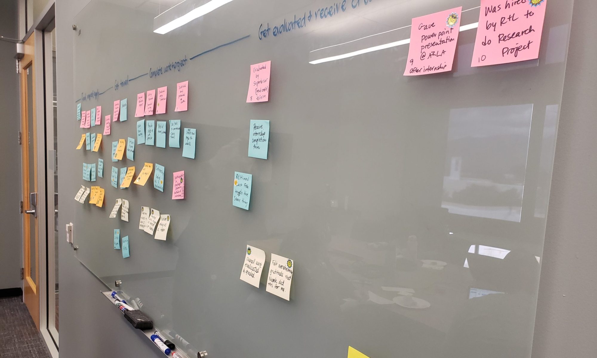
Over the past several months, our UX team has been preparing for updates to our primary, global drop-down menus on the library’s main website. We started this project in anticipation of significant building renovations and the launch of associated new services to happen in 2020 (see CATalyst Studios). We realized that our existing menu structure didn’t allow for this evolution in our services.
We still have some work to do to before launching our new menus, but in October, I presented with two colleagues, America Curl and Lara Miller, on our progress to date. This was part of the University of Arizona’s IT Summit.
In this talk, we covered our user-centered and content-focused process, with our main techniques being card sorting and tree testing. We’ve also done some prototype testing and first-click testing. Hope you enjoy!
When the UX team moved out of the technology department to be housed centrally in administration, I knew we’d expand our scope to include projects related to physical space. I didn’t know that for two weeks at the end of the fall semester, I’d be immersed in a furniture study to quickly gather feedback from students on dozens of furniture options. It was a new thing for the UX team. It was interesting. And I thought I’d share what we did.
Preliminary user interviews about furniture in spring 2018 (that’s me on the left)
Context
We’re undergoing a massive, multi-million dollar renovation to our Main and Science-Engineering Libraries. Part of the renovation includes new furniture for our ground floors. In early November, 2018, we received dozens of chairs, a few tables, and a couple pieces of lounge furniture to pilot for a few weeks. They were placed throughout the Main Library ground floor, with tags identifying them.
We were given a quick timeline to gather as much feedback as we could from students to guide decisions. The UX team (3 of us) worked with our new assessment librarian, Lara Miller, and staff from access services, John Miller-Wells and Michael Principe.
Methods
Michael and John created a survey with Qualtrics that people could take online or fill out in person. They have student workers dedicated to data collection who collected observational data (primarily counts of furniture usage) and transcribed the print survey results.
Survey we provided in person and online
Lara and the UX team conducted more qualitative observations, and did some informal interviews with people using the furniture.
We placed stock photos that the companies gave us (just a selection of some of the furniture) on boards in the space and asked people to mark their favorites with sticky notes. Realizing quickly that this did little to tell us why pieces were marked, we asked participants to also describe the furniture in a few words.
Stock photos with instructions for passersby to vote on their favorites and describe them
Getting close to the end of the pilot, we realized we didn’t have as much feedback as we wanted on particular choices, such as the laptop tables. We also wanted to compare some specific stools and specific chairs side-by-side.
To get this feedback, we posted photos of the pilot furniture on a large whiteboard and then placed the actual furniture nearby. We asked participants to mark their favorites with green sticky dots and their least favorites with red sticky dots. (We since realized this would be an issue for colorblind users, so in future might use something like stars and sad faces instead).
Pilot furniture placed around a whiteboard where students could provide feedback
Limitations
We were short on time, it was near the end of the semester, and we had a lot of furniture to get feedback on. The stock photos also didn’t match the pilot furniture exactly.
Feedback on popular stock photos – we didn’t actually have this furniture as part of the pilot
It’s hard to get authentic feedback on this type of thing. Most of the data we collected was attitudinal rather than behavioral. And if we really want to make the best decisions for our students, we should know what they do not just what they think. The best way to discover how students actually use the furniture and what they prefer might be an ethnographic study, but we didn’t have time or resources for that.
A significant issue with most of our methods is that students could vote on a chair for aesthetic reasons (color, shape) when they haven’t actually used it in any real capacity. So a chair could score highly because it’s attractive but not particularly functional, especially for long periods of study.
The decision making process at the end of the day was also unclear, as it’s a negotiation between the library project team, the architects, and the vendors. We can provide the data we collected, but then it’s essentially out of our hands.
Findings
We ended up with 283 completed surveys, 606 sticky notes on the stock photos, and 573 sticky dots on the whiteboards (we removed the stickies as we went so the boards wouldn’t get overwhelmed). We also had 13 days worth of usage data and a handful of notes from qualitative observations.
While we had a couple of hundred survey results, since each survey only referred to a single piece of furniture it was hard to make any conclusions (just 0-5 pieces of feedback per piece). We found that the comparative data was much more useful, and in retrospect would have done more of this from the get go.
We put together all the data and in December were able to present a selection of furniture we recommended and didn’t recommend for purchase.
In the chairs category, most of the recommendations were adjustable, on wheels, with arms, and with fabric seats. For stools, the ability to adjust up and down for people of different heights was especially important. Those chairs we didn’t recommend tended to have hard plastic seats or metal arms, be non-adjustable, or be less comfortable for longer term use.
Stools and chairs comparison – results of preference voting
The winning laptop tables had larger surfaces (to fit a laptop and a mouse/notebook), felt sturdier, and the legs could fit under a variety of chairs or tables.
Laptop table comparison – results of preference voting
Overall, we didn’t find anything groundbreaking in the data. But we do now have some solid recommendations to share with the powers that be. And we did learn a lot just through the process, which was in many ways an experiment for us:
how to gather data on people’s attitudes around furniture
how to act quickly and iterate on our process
it’s possible to gather a bunch of data in a short, focused amount of time
a mixed methods approach works best for this type of thing (as it does for most things!)
At the University of Arizona Libraries, we’re replacing Millennium and Summon with Alma and Primo later this month as our library services platform and primary discovery tool. Needless to say, it’s a critical piece of the library’s experience. It’s the main way people find library materials (both digital and print), access full text, request holds, and manage their accounts. So checking and improving its usability is key.
The team
The focus of our (small but mighty) UX team the past couple months has been Primo. It’s critical, so we were all in.
We hired a grad student intern from the School of Information, Louis Migliazza, who focused his summer internship on Primo usability. That was awesome. Student worker Alex Franz and content and usability specialist Cameron Wiles took turns pairing with Louis for the testing.
We also met weekly for an hour with Erik Radio, our metadata librarian and product owner for Primo. He helped us come up with solutions and worked on the backend to make improvements, contacting Ex Libris when needed.
And we met weekly with the broader Primo implementation and discovery teams, which included stakeholders from throughout the library and were led by our fearless project manager, Joey Longo. At these meetings, we regularly shared our findings and gathered feedback on our plans to address them.
The methods
Louis and Erik’s leadership over the past 6 weeks made it possible for us to conduct a ton of usability testing and make significant customizations to the interface. Building on preliminary research and testing we’d started earlier in the spring, we ultimately tested 22 tasks with 91 participants.
We used Tiny Café (our pop-up food/drink station in our Main Library lobby) to recruit passersby for testing, who were by and large undergraduate and graduate students. We had a handful of library staff stopping by, too. We did this on Tuesdays and Wednesdays for two hour blocks (4 hours a week total). Ultimately, we held 27 hours of Tiny Café, intercepting 84 passersby.
Tiny Café
We’d usually test 2 or 3 tasks per participant. And the tasks changed nearly every week as we learned what we needed to learn, made adjustments to the interface, tested again, and/or moved on to the next tasks we needed to test.
We also recruited faculty with help from our liaison librarians. The majority of those sessions were lengthier, moderated, remote tests using Zoom.
All told, participants included 36 undergrads, 31 grad students, 7 faculty, 7 library staff, and 10 community users.
Findings
Searching and filtering
Participants were 100% successful at:
Finding a specific item by title
Searching for journals by topic or title
Renewing an item
One grad student said, “Looks pretty intuitive, pretty easy to navigate.” And one undergraduate said, “I think it’s easy to find what you’re looking for.”
Original Primo basic search interface, where participants would start their search
They were mostly successful at using filters, specifically:
Using facets to narrow results (84% success)
Finding an item at a specific library (83% success)
Some of those who weren’t successful would only use the search box to narrow their results, avoiding filters entirely. Or they would skim through their results to try and find an item like what we were describing. (In our scenarios, we intentionally didn’t ask them to “use the filters” to avoid leading them in that direction. Rather, we asked them to “narrow your results to only books from the last ten years” and “find a book that’s in the Health Sciences Library.”) That said, we did make a number of changes to our filters along the way (described later on), hopefully making them a bit more useful.
Original Primo search results page, without customizations
Signing in
We observed some issues with signing in, too. Only 83% of people successfully signed in to see the due dates of checked out items. To address this, we changed the language in the top-right utility navigation from “Guest” to “Sign in/account.” We also removed the word “English” along with the language options, which caused confusion (and disappointment, since Spanish wasn’t an option and we’re a Hispanic-serving institution).
Customized utility navigation
Saving items
Interestingly, only 2 of 8 students successfully saved an item to their account. But then 4 faculty and PhD students were successful on first attempt. This might tell us that undergrads don’t tend to think of or use this feature. It doesn’t fit with their mental model when it comes to saving articles.
When asked, they said they would use other methods outside the tool, such as bookmarking the URL or emailing themselves. We didn’t make any changes to the interface based on this, but found it interesting.
Only faculty and PhD students were successful in using the pin icon to save their results
Requesting items
The most challenging task was requesting a hold. Only 40% of participants were successful. This is because you have to be signed into Primo in order to see the “Request” link. If you’re not signed in, the option doesn’t appear. We ran a subsequent test where we were already signed in, and 100% of participants were successful.
By default, Primo has a yellow bar that says “Sign-in for more options,” but people didn’t notice this most of the time. Especially since it’s in the “View it” section of the records, and people tend to be looking near the “Find it” section.
“View It” and “Find It” sections of Primo item records, without customizations
We found it problematic that the interlibrary loan option appears when not signed in, but the hold option does not. In contrast to requesting a hold, 90% of participants were successful in requesting an interlibrary loan, using the link: “Borrow this item from another library.” By requiring users sign in, the interface essentially hides functionality from the user, causing a significant usability issue.
Ideally, we think, the “Request” link should always appear and upon click, the user is prompted to sign in. (This is how our current catalog works). But with this not being possible, the only thing we could really do is customize the message. So we changed it to say: “Want to place a hold? Sign in.”
Custom text to indicate people need to sign in to place holds
User impressions of usability
A few weeks into our testing, we decided to add on a System Usability Scale survey after each session to gather overall impressions in a more systematic way. Of the 32 people who filled it out:
89% thought various functions were well integrated
84% would use Primo frequently
83% thought most people would learn to use Primo very quickly
78% think Primo is easy to use
70% were very confident using Primo
Needless to say, we were pretty happy with these numbers.
Other customizations
Changing terminology
We found that some of the default terminology wasn’t ideal. For example, one grad student said, “Loans? I think about money…I just don’t like the word ‘loans.’”
Here are a few terms we updated:
Item in place > In library
Full text not available > Available to request
Fetch item > Find a specific item
Expand my results > Include results beyond UA Libraries
Loans > Checked-out items
Updating the homepage search box
To mimic existing Summon and Catalog options while focusing on the most common search behavior, we:
Created drop-down options for title, author, and call number
Put an Advanced search link in the bottom right
Added buttons to take users to the most common alternate starting points: See all databases and Find a journal
Simplified homepage search box
Removing less helpful or redundant elements
To make things as intuitive as possible, we:
Removed the vendor product name
Removed the sign-in banner for users on campus
Removed redundant title attributes from the tile menu
Removed Personalize option (redundant with subject filters)
Reduced and re-ordered the Send to options
Customized “Send to” options and ordering
Making search results and filters more intuitive
To reduce cognitive load, we:
Moved filters from the right to the left
Re-ordered filters so that the most-used options are at the top
Changed “Availability” to “Show only” as a filter category
Customized the icons to be more consistent and recognizable
Removed filters that were confusing, less useful (e.g. “Call number range”), or redundant (e.g. “Location” in favor of “Library”)
Reduced number of items displaying by default underneath each filter category
A preview of our filter customizations
Customized icons for book, article, and multiple versions
Putting content at point of need
To help users along, we:
Added a Locate button to print records that takes people to the call number guide
Put searching tips below the Advanced search option as well as the Library search landing page
Added suggested librarians for when people search particular disciplines
Added a link to WorldCat above the search box
Customized primary (tile) menu
Next steps
This is a huge change for our users, but we’re feeling pretty good about where we’re at. We did a lot of testing and a lot of tweaking, and participants were overall successful at completing the primary tasks we’d identified.
We go live on July 20(ish), and are sure to discover more UX concerns once we have people using the system in their daily lives.
We’ll continue to gather feedback and make adjustments as needed.
Perhaps one undergraduate said it best: “I think I liked the old interface better because I’m comfortable with it…I’m sure once I get used to [Primo], it will be ok.”
Last fall, I was asked to help lead an ambitious, library-wide project. It aimed to reimagine our strategic planning process through an inclusive, human-centered, design thinking approach. Having just moved into our library administration (from our technology team), it was a perfect opportunity to foster and support UX thinking across the organization.
With outside consultant Elatia Abate to guide us, over 117 library staff worked in teams to gather information, empathize with our end users, and iterate on solutions to grand “How might we…?” challenges. Library staff got to practice conducting user interviews, synthesizing findings, creating personas, and prototyping ideas. They also worked together with staff from other departments, building trust and long-lasting relationships.
I presented our work through a hands-on workshop at this year’s Designing for Digital back in March. Then in May, the University of Arizona Libraries unveiled one of the outcomes from this project: our new strategic map.
Slides from the March presentation, titled “Design Thinking for the Masses: Creating a Culture of Empathy Across a Library Organization”:
I work at the University of Arizona (UA), and in talking with a colleague across campus a few weeks ago, we realized that there is no venue for like-minded UXers to get together.
So we formed an informal group, UX@UA. Everyone interested in user experience is welcome! Join the conversation in our UX@UA Slack Team (use your UA email) and our community in Meetup.
At our first meetup in August, we had about 20 people attend from all across campus, including web designers, web developers, graphic designers, business analysts, and teaching faculty. We watched a webinar on selling the value of UX.
At our second meetup in September, we had just a handful of people, including faculty and grad students. We watched a webinar on identifying users’ “top tasks,” and talked about future collaborations.
At our third meetup, we’ll hear from two members on their recent UX projects. Hope to see you there!
2019 update: We have grown to over 300 members and now have an official UX@UA website through the University of Arizona!
Writing plays a role in almost everything we do. It’s how we document our knowledge, share our stories, and ask our communities for help. It’s a tool to teach, influence, and persuade those around us. And in today’s digital age, we’re all publishers, sharing content with the world at the push of a button (literally). From webpages, to signage, to emails – writing is fundamental to our everyday lives.
Sadly, there is a lot of mediocre content out there: policy-driven websites with mountains of text, building signs that don’t actually tell you what you need to know, convoluted emails that leave you wondering, What was the point of that? Today’s reader is bombarded with endless streams of information and simply doesn’t have the time to sift through and make sense of it all.
Let’s do our part to end the madness. Writing Effectively in Print and on the Web: A Practical Guide for Librarians encourages you to put your readers at the heart of all your content, ensuring that it is engaging, relevant, and useful. You’ll learn techniques to write with clarity, precision, and purpose, which will serve you well in both your professional and personal life.
And in other news…. I published a book! It came out at the end of September and I’m hoping it will be useful for anyone who is interested in dabbling in usability testing for the first time or leveling up their skills. Whether you’re on a string budget with little staffing, or you have a larger web team that’s committed to improving the user experience, this should be a worthwhile read.


