I’ve written and taught on the topic of web content for a number of years. And this past year, I’ve been thinking a lot about how our content decisions impact the accessibility and inclusivity of our websites.
The goal of this presentation was to cover the key principles to creating content that is useful, usable, and accessible to all. I discuss techniques including plain language, heading structure, content prioritization, meaningful links, alternative text, and more. My 5 tips for better, more inclusive web content are:
Know your audience. Create content with your readers in mind.
Keep it focused and simple. Reduce cognitive load with straightforward and succinct content.
Focus on clarity. Strive for immediate comprehension.
Organize and structure. Your content flow should be intentional, point-of-need, and easy to skim.
Make it readable. Be intentional with font choice, white space, and formatting.
Big thanks to Ferris State for inviting me, and for recording and captioning the presentation!
I had the privilege of delivering the keynote presentation at this year’s Michigan Academic Library Association (MiALA) Annual Conference. I had been preparing this talk for a few months. I knew I would talk about library value (the theme for the conference) and how user experience practices could help libraries build upon and expand their impact.
I thought I’d share a couple images from my process in putting this together. I began by generating ideas around value we provide to different target audiences: learners, instructors, researchers, community, and campus.
Initial idea generation and mind mapping
I started working through my slidedeck, then paused to outline what I was trying to do. This was helpful in organizing my ideas and noticing gaps.
Visual outline of the presentation
Here’s my final slidedeck.
Some of my key messages:
The mission of academic libraries is tremendous, so we are challenged to focus on what matters most.
We should focus where our organizational goals and our user needs overlap.
We can use design thinking as a guiding framework: understand, create, validate.
We can better understand our users and make user-centered decisions if continually build our capacity for cognitive empathy.
While building understanding, we should practice cultural humility and realize we will never be experts of another’s experience, only our own.
There are many emerging ways to advance student success by supporting inquiry and learning in a rapidly changing world. We can focus in on some of the things that matter most to students, such as:
belonging
health
financial stability
job preparation
There are also ways to excel researcher productivity by supporting creative endeavour, scholarly communication, and the global academic community. We can focus on what matters most to scholars, such as:
expertise
research data
publishing
For members of our community, we can support social, cultural, and economic impact. We can focus on things like:
lifelong learning
preparing youth
local economy
local partnerships
Overall, I really enjoyed this project and hope people enjoyed the talk.
If I were to do it again, I would find a way to incorporate empathy and understanding towards ourselves, both personally and as organizations. It can be overwhelming to think of all the possibilities of what academic libraries could be doing, and we need to be mindful of our own barriers and challenges as well as those of our end users.
Also, MiALA was a blast. Great conference. I learned a lot.
Forms are prevalent across the web, yet so many are poorly designed. They can quickly become a source of frustration.
Last year, Ann Shivers-McNair and I bonded over our passion for form content and design. So we developed a presentation on making better forms for people, presented at edUi last October.
Forms have been on my mind a lot recently, and I thought it would be useful to unpack the presentation into some of the key principles and considerations for easy reference. And I’ve added and slightly revised a couple based on other things I’m learning. So here goes.
3 key principles
Simplicity. Avoid the complicated and unnecessary.
Avoid instructions on how to fill out the form
Make sure every field serves a purpose
Get rid of any unnecessary fields (e.g. phone number, fax number, birthdate)
Never require a field if you don’t really need it
Inclusivity. Create forms for everyone.
Avoid jargon
Avoid legalese
Write like you talk
Be inclusive in your options
Readability. Use logical sequencing and follow conventions.
Be succinct
Place field labels above the field
Left justify, rag right
Allow for lots of white space
Use sentence case
Small but mighty considerations
Form names. Make it clear what you’re doing.
Start with a precise action verb (e.g. “Apply,” “Request”)
Use an action verb in the link to the form, too (e.g. “RSVP for event”)
Avoid too many nouns in a row
Optional vs. required fields. Make them intuitive to recognize. (Be aware these conventions are a moving target and may depend upon audience).
Most fields should be required
Indicate which fields are optional by saying optional
Be consistent in how you indicate required vs. optional fields
Asterisks are a common convention to mean “required”
Name fields. Make them inclusive.
Don’t limit character length (or if you must limit, make that limit 70 characters for full name or 50 characters for first name or last name)
Don’t force first-letter capitalization (e.g. charley)
Don’t prevent capitalization of a second name or within a name (e.g. Bonnie Jean; McClelland)
Allow hyphens in names (e.g. Sykes-Casavant)
Use one “Full name” field over separate “First name” and “Last name” field, unless it’s really necessary
Gender fields. Make them inclusive.
Avoid binary gender selectors
Allow write-in responses
Make it optional (when possible)
Selectors. Give clear options.
Pick a thoughtful default that’s either the most common answer or the first in a logical sequence
Put the most common options at the top, and for longer lists, use alphabetical sequencing
Use the right selector for the information you are soliciting (e.g. dropdowns, radio buttons, check boxes)
Question scope. Ask one question at a time.
Don’t combine multiple questions into one
Isolate the pieces of information you are asking for
Use logic to order questions that follow from previous information
Contextual help. Provide helpful hints at the appropriate time. (Be aware these conventions are a moving target and may depend on audience).
Use field labels to describe the field, and place them above the field
Use help text to provide an explanation or further information
Maybe use placeholder text to suggest the type of content you expect
Be cautious with placeholder text, and don’t use it as a substitute for field labels or help text
Feedback messages. Provide informative messages at the right time.
Make it clear when there are errors
Make it clear what any errors are
Don’t stress users out with error messages before it’s necessary
In confirmation messages, make it clear what the user just did and what to expect next
The slidedeck
Here’s the slidedeck that these tips were based on. It includes a few more details and a whole bunch of examples.
Hope you find this helpful! Please share comments on other things I should add.
I had the privilege of presenting as part of an online panel last October with my brilliant colleagues, Emily Daly from Duke University and Josh Boyer from NCSU. We talked some shop and had a lot of fun. Check out the full recording if you’re interested in learning more about what it’s like to do UX work in large academic libraries.
This session was organized by the University Libraries Section (ULS) of the Association of College & Research Libraries (ACRL). The first session was pretty popular, so we hosted a “part two” in February where we dived into more details and examples of our work. Here it is for those of you who missed it!
I presented a webinar for LibUX last week that was super fun. I talked about knowing your readers, organizing your content, and writing with clarity.
Check out the full recording:
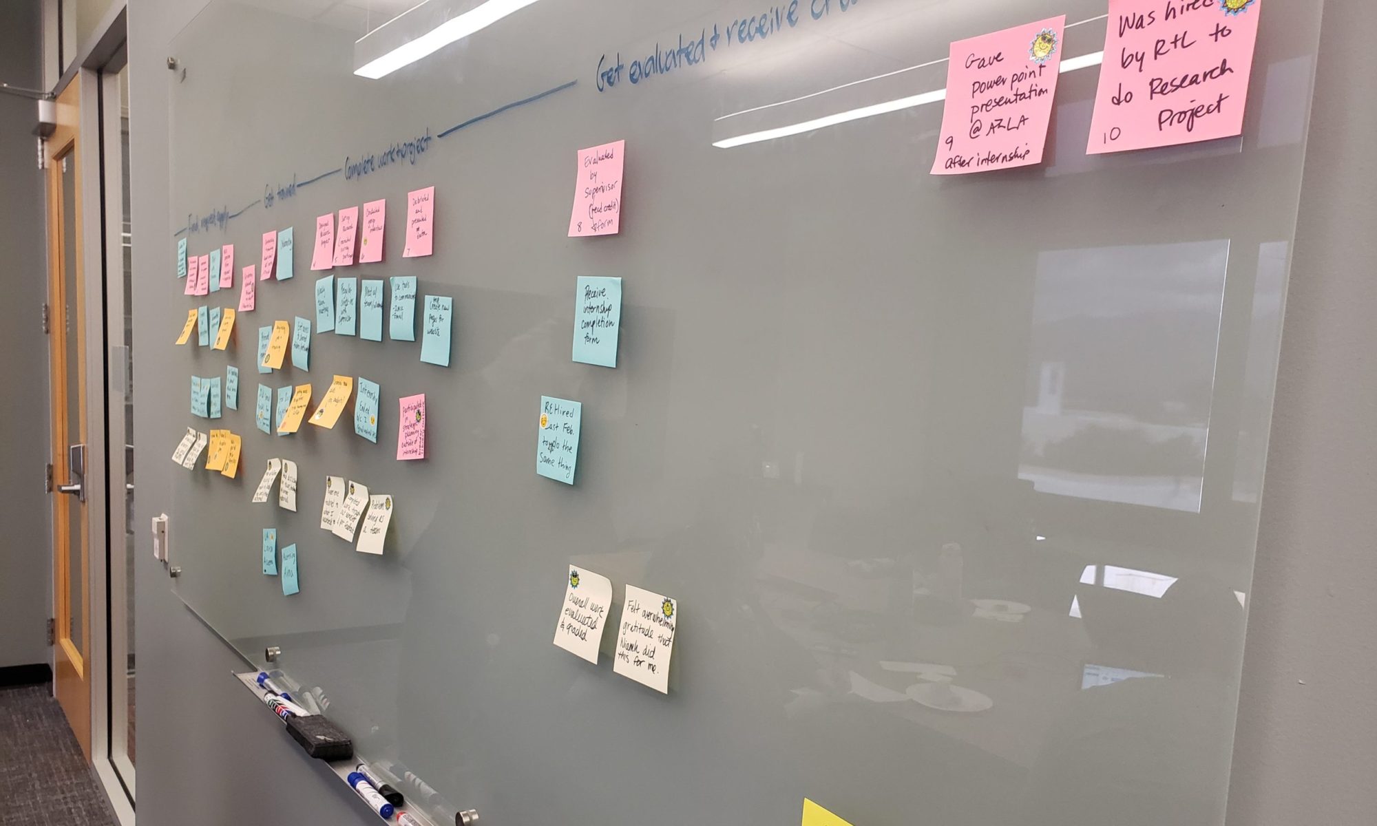
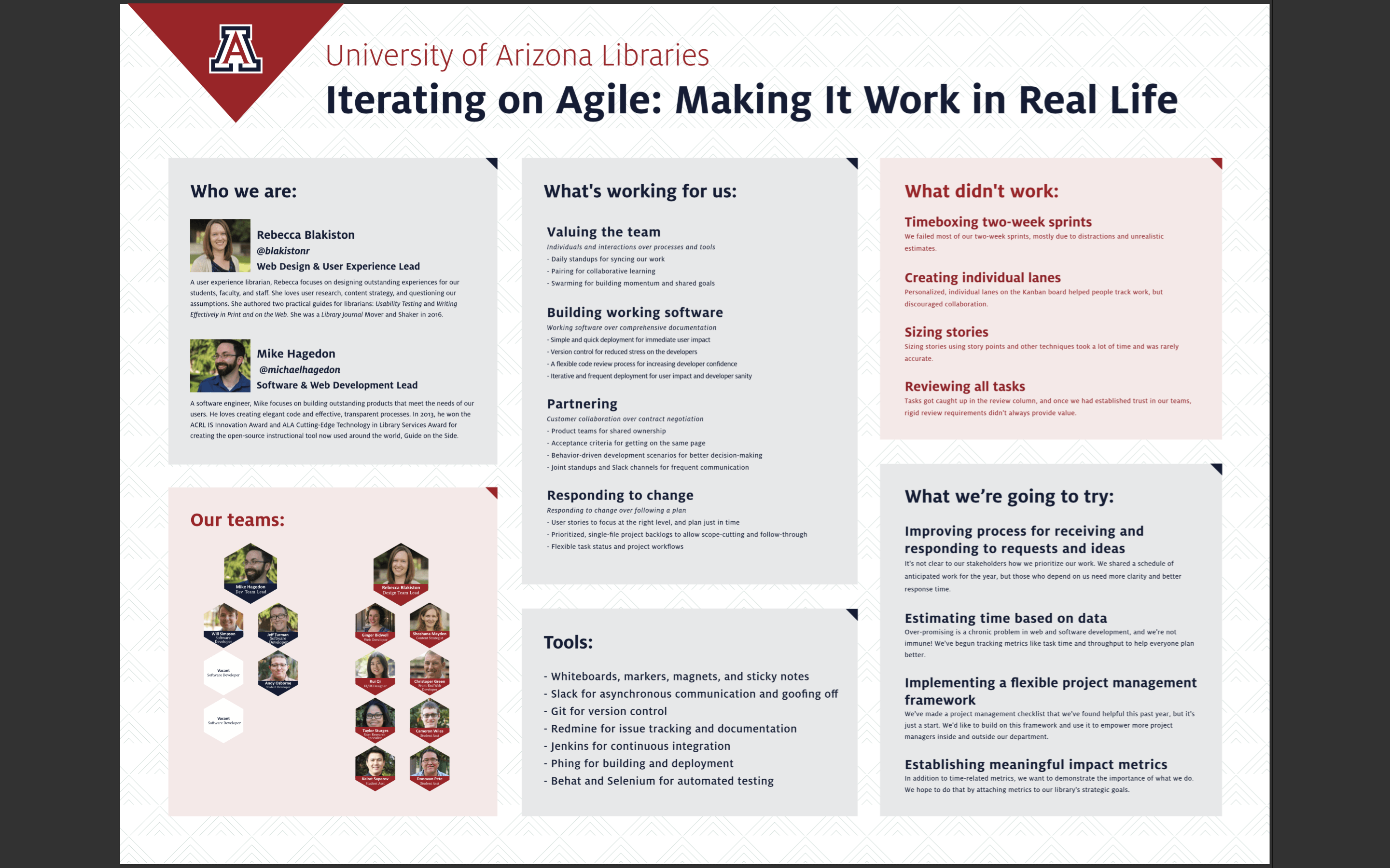
I’m excited to attend Code4Lib for the first time this week. While I don’t code currently, I do manage a team of uxers, designers, and coders. I’m looking forward to meeting likeminded colleagues and learning lots!
Mike Hagedon is our dev team lead and I’m our design team lead, and we’ll be presenting a poster on our design + dev experiments in agile methodologies. I hope if you’re attending you’ll come chat with us! Learn what we’ve tried, where we’ve succeeded, and where we’ve failed.
We also want to hear others’ perspectives and experiences. The poster will be interactive, so we’ll ask you to annotate it with questions, examples, and ideas. Here is the poster we have so far:
At Internet Librarian this week, I was thrilled to present on it alongside David Lee King. It was a lot of fun – we talked about why web writing matters, why we’re not so good at it, and how we can do it a bit better. Sadly our third panelist, Elaine Meyer, wasn’t able to attend at the last minute, but I think David did her justice in presenting her content.
Thanks for everyone who came out and participated. It’s cool to see so many people interested in creating better experiences through better content. I had a blast. Here’s my slide deck:
WordPress reminded me that I’ve been slacking on this blog, sorry about that…
It’s a bit late, but this is a presentation I gave along with our web content strategist, Shoshana Mayden, at edUi earlier in the fall:
EdUI – a great conference as always.
And some news: just last month, we were able to secure a permanent position. That’s right, our library now has a full-time content strategist! And it’s pretty fabulous. (She was previously on a one-year contract. A year of hard work proved how extremely valuable content strategy is to our organization).
Presentation I gave as part of the UX Unconference we organized at the UA Libraries early in December. This is a 20 minute version of the 4-week long class I teach for Library Juice Academy.