My first project at Ad Hoc LLC was an overhaul of a state agency’s website, the Louisiana Department of Agriculture and Forestry (LDAF). Check out the website we launched last fall at: ldaf.la.gov. 🎉
Partnering with LDAF stakeholders, we were able to improve task success rates, reduce time on task, and increase user confidence in the website overall. I led research for the project, which included market/competitor analysis, a top tasks survey, card sorting, tree testing, first-click testing, and usability testing (pre- and post). There was also a ton of information architecture and content strategy work.
It comes as no surprise to most that government websites can be hard to use. And getting a chance to improve this website for the people of Louisiana was really rewarding.
Over the past several months, our UX team has been preparing for updates to our primary, global drop-down menus on the library’s main website. We started this project in anticipation of significant building renovations and the launch of associated new services to happen in 2020 (see CATalyst Studios). We realized that our existing menu structure didn’t allow for this evolution in our services.
We still have some work to do to before launching our new menus, but in October, I presented with two colleagues, America Curl and Lara Miller, on our progress to date. This was part of the University of Arizona’s IT Summit.
In this talk, we covered our user-centered and content-focused process, with our main techniques being card sorting and tree testing. We’ve also done some prototype testing and first-click testing. Hope you enjoy!
Forms are prevalent across the web, yet so many are poorly designed. They can quickly become a source of frustration.
Last year, Ann Shivers-McNair and I bonded over our passion for form content and design. So we developed a presentation on making better forms for people, presented at edUi last October.
Forms have been on my mind a lot recently, and I thought it would be useful to unpack the presentation into some of the key principles and considerations for easy reference. And I’ve added and slightly revised a couple based on other things I’m learning. So here goes.
3 key principles
Simplicity. Avoid the complicated and unnecessary.
Avoid instructions on how to fill out the form
Make sure every field serves a purpose
Get rid of any unnecessary fields (e.g. phone number, fax number, birthdate)
Never require a field if you don’t really need it
Inclusivity. Create forms for everyone.
Avoid jargon
Avoid legalese
Write like you talk
Be inclusive in your options
Readability. Use logical sequencing and follow conventions.
Be succinct
Place field labels above the field
Left justify, rag right
Allow for lots of white space
Use sentence case
Small but mighty considerations
Form names. Make it clear what you’re doing.
Start with a precise action verb (e.g. “Apply,” “Request”)
Use an action verb in the link to the form, too (e.g. “RSVP for event”)
Avoid too many nouns in a row
Optional vs. required fields. Make them intuitive to recognize. (Be aware these conventions are a moving target and may depend upon audience).
Most fields should be required
Indicate which fields are optional by saying optional
Be consistent in how you indicate required vs. optional fields
Asterisks are a common convention to mean “required”
Name fields. Make them inclusive.
Don’t limit character length (or if you must limit, make that limit 70 characters for full name or 50 characters for first name or last name)
Don’t force first-letter capitalization (e.g. charley)
Don’t prevent capitalization of a second name or within a name (e.g. Bonnie Jean; McClelland)
Allow hyphens in names (e.g. Sykes-Casavant)
Use one “Full name” field over separate “First name” and “Last name” field, unless it’s really necessary
Gender fields. Make them inclusive.
Avoid binary gender selectors
Allow write-in responses
Make it optional (when possible)
Selectors. Give clear options.
Pick a thoughtful default that’s either the most common answer or the first in a logical sequence
Put the most common options at the top, and for longer lists, use alphabetical sequencing
Use the right selector for the information you are soliciting (e.g. dropdowns, radio buttons, check boxes)
Question scope. Ask one question at a time.
Don’t combine multiple questions into one
Isolate the pieces of information you are asking for
Use logic to order questions that follow from previous information
Contextual help. Provide helpful hints at the appropriate time. (Be aware these conventions are a moving target and may depend on audience).
Use field labels to describe the field, and place them above the field
Use help text to provide an explanation or further information
Maybe use placeholder text to suggest the type of content you expect
Be cautious with placeholder text, and don’t use it as a substitute for field labels or help text
Feedback messages. Provide informative messages at the right time.
Make it clear when there are errors
Make it clear what any errors are
Don’t stress users out with error messages before it’s necessary
In confirmation messages, make it clear what the user just did and what to expect next
The slidedeck
Here’s the slidedeck that these tips were based on. It includes a few more details and a whole bunch of examples.
Hope you find this helpful! Please share comments on other things I should add.
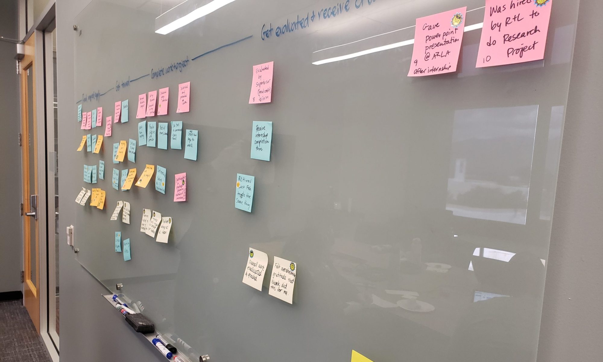
I presented with my colleagues Ginger Bidwell & Josh Williams yesterday, “Extreme Website Makeover: Center for Creative Photography Edition.” It was at the annual Arizona Library Association (AZLA) conference held in Phoenix.
I started off by discussing who was involved, how we communicated with stakeholders, what user research we conducted (survey, personas, remote card sorting), our competitive analysis, and how we developed a purpose, voice & tone for the new website. Ginger discussed all things Drupal, including how we built structured content and why it’s so important, and Josh discussed the visual design decisions and how & why we went with a responsive design. The audience seemed very interested in the process, and for many of them working in public libraries across the state, this was at the first time they had heard of techniques like personas, card sorting, structured content, and responsive design.